SHOETIYA
Illustrated logo and identity concept for a fashion startup
Year:
2023
Categories:
Creative Graphic Design
Description
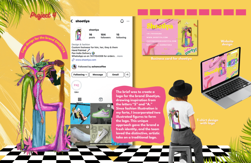
Shoetiya was one of the first branding projects where I got to merge fashion illustration with logo design — and honestly, that’s my dream combo. The brief was to create a unique logo inspired by the letters “S” and “A”, but I wanted to push it beyond just letterforms.
So instead of using typical shapes or icons, I created two illustrated figures that subtly formed the initials. It gave the identity a fresh, expressive tone — something more human and fashion-forward, rather than overly corporate. The brand team loved that it felt like a signature more than a stamp.
Conclusion
Shoetiya felt like a milestone for me. It was the first time I confidently blended my illustration style with identity design — and it worked. The project challenged me to think not just as an artist, but as a communicator: how do you make a logo that says fashion, movement, personality, and still stays readable?
This also taught me that “rules” in branding can bend. You don’t always have to go minimalist to be memorable. Sometimes, hand-drawn lines say way more than geometric grids. And that’s exactly the kind of work I want to keep doing.